Recently we celebrated the Diversity, Equity, Inclusivity week at Solita, learning more and discussing our differences and biases. The very same week the React Finland conference took place, in which quite some time was devoted to the topic of accessibility. Great timing, wouldn’t you say? I attended a workshop conducted by Eevis Panula, a Certified Professional in Web Accessibility (check out also her talk at the conference!); she inspired me to write this blog. We don’t talk about accessibility enough!
Let’s start with the basics of what is accessibility, why should we care, how can we help, and what is inspiration porn. Then I’ll dive a little deeper into the practicalities of accessibility testing - both automated and manual.
What is it about?
Accessibility (abbreviated to a11y) is designing products, services, environments in a way that people with disabilities can use them - that means both in the physical world and in digital spaces. As developers we will focus on the latter.
What do you picture when you read “people with disabilities”? Very probable that your mind played the stereotypical images of a blind or deaf person, but we have to remember that there are many types of disabilities: cognitive, visual, auditory, motor, mental-health-related, compounded… The biggest group of them, cognitive, is the “invisible” one, which unfortunately makes it so easy for some people to forget.
Another thing to consider is the permanence of the disability; have you ever hurt your hand and had trouble using your daily devices? Or held a cat in your arms so you only had one hand free? You had a disability - temporary and situational, respectively.
One might think of the disabled as a minority. While technically true, this idea hides the fact that it is a huge group in our society. In Finland over 1 million people need digital accessibility, making up close to 20% of the population. Similar numbers appear on the EU level: an estimated 100 million of 447.7 million people in the EU have some form of disability (meaning that this number does not include temporary and situational disabilities). [source FI, source EU]
Why should we care?
First of all, the hopefully obvious - it’s the right thing to do. It just is. We are all equal human beings deserving the same ease of access to services.
And even if you don’t believe in the sentence above (we can’t be friends then, I’m afraid), if you’re egoistic - do it for yourself. We all experience situational disabilities like trying to read a map on our phone screen in bright sunlight.
Evgenia Alefragki wrote already on this blog about benefits of creating digital services with accessibility in mind right from the beginning - it’s good for designers, it’s good for developers, it’s good for the users (yes, all of them). If you have trouble convincing your manager or clients to not ignore accessibility this time, remind them that they are playing with a big part of their customer base. Not only can they lose those people, but also all their friends and relatives who will hear the stories of how the parallel scroll caused dizziness so bad that the webpage was totally unusable.
You may also think “well, but I know that the tool I’m building will be used by a small, very specific group that I met”. First of all, you can’t be 100% sure if any user of that group is disabled. Secondly - perfectly working keyboard navigation will also benefit the power users. When talking about accessibility, no-mouse-in-use is stereotypically associated for example with people suffering from Parkinson’s, but as usual, there’s so much more to it.
Another angle is the legislation and the future of it; right now in the EU the public sector services have to be accessible. Soon a similar law will be issued regarding parts of the private sector as well, for example e-commerce. We can expect similar rules to become applicable in almost all apps and services we’re building, so why not start the process right now? In short: it’s a win-win situation. For whoever you’re doing it, they will love you for that.
How can we do our part?
As developers, we could work on our habits of using semantic HTML and generally think about accessibility as we go (more technical details in sections below). We actually should care about it right from the beginning - doing small things all the time rather than waiting till a milestone to handle all the accumulated issues, as that can unfortunately result in a need for a bigger rewrite (and we all know that it won’t happen cause it’s too much work for something perceived as invisible).
Focus on progress over perfection. To be honest, it is impossible to make a service perfectly accessible for everyone. Take for example high color contrast - for one person it’s a blessing, it helps a ton, while another person’s symptoms might be triggered by the very same thing. Like in many aspects of life, it’s all about balance.
One more important thing: you don’t know how it is. Even if you are disabled yourself, all you know is one person’s point of view. Don’t assume, but gather feedback, listen to your users, ask about their experiences - they will gladly tell you what’s wrong. Also, the attitude is important; the disabled are equal humans and equal users, they don’t deserve being patronized or being an object of inspiration porn.
Yep, inspiration porn. It’s something I’ve seen a lot, I know it well, yet only now I came across the actual name of the phenomenon. Have you seen those inspirational pictures with captions like “If they can do it, what is stopping you?” or “The only disability in life is a bad attitude”? Sure you have. As Rea Strawhill writes on her blog, inspiration porn is “objectification of disabled people in the media, which serves the purpose of making non-disabled people feel better about themselves” which includes “praising disabled people and calling them inspirational for carrying out daily tasks, praising them for overcoming their disabilities, or non-disabled people receiving praise for helping a disabled person”. The whole article is an eye-opening read where Rea explores different stereotypes and thought patterns caused by inspiration porn and explains why they are wrong and hurtful for the disabled. Why I’m mentioning it here is because it also creates the general tendency to put the responsibility onto the disabled to overcome their limitations instead of the society to make the environment more accessible. Let’s be better than that and make the web a little easier to use, bit by bit.
Practically how, part 1 - automated testing
Good news: there are free tools to do some accessibility testing of your web app. Bad news: they only catch 15-40% of the issues, so even in the best case it’s less than half. It’s a good start though, reaching for the low-hanging fruit. Remember, progress over perfection.
Most of the tools work in a similar way; they are often a browser extension that goes through the code of the page you’re on, catching things like missing alt on an image (they can’t judge whether the existing alt is of good quality though), crooked headings hierarchy or wrong tab order. They scan one page at a time, which means you have to re-run the tool on each page of your service. That actually may be a good thing, because you get the issues in small, more digestible pieces instead of 17 329 issues at once. It’s easier to locate them in your code too!
Tools:
- aXe Devtools: free Chrome extension, even more advanced paid option available too.
- WebAIM WAVE: Chrome, Firefox, Edge extension; similar to aXe, a little different way of visualization.
- taba11y: Chrome extension for visualizing the tab order. Warned by Eevis Panula that people sensitive to fast animations might get dizzy looking at the screen when taba11y runs.
- Lighthouse in Chrome: accessibility part might be a little more limited than eg. in aXe since Lighthouse’s purpose is so much broader.
- Plugins and extensions in code editors, linters, testing tools.
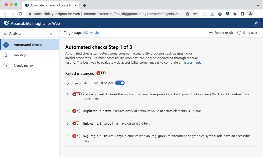
Example of using aXe Devtools in a project:
aXe Devtools are available conveniently behind right click -> Inspect, in the view so familiar to all web developers. In the free version of aXe you can only run a scan of a full page, in paid version you can scan part of your page or do “Intelligent Guided Tests”. A full-page scan is a good starting point though:
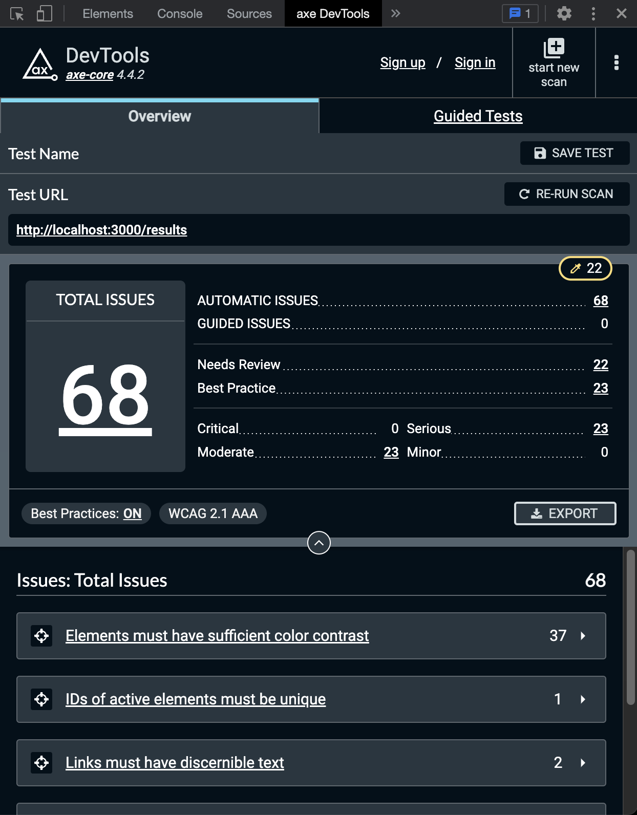
You get an overall number of issues, but they are also categorized by severity, “needs review” and “best practice”. Exporting the report and saving the test are paid features.
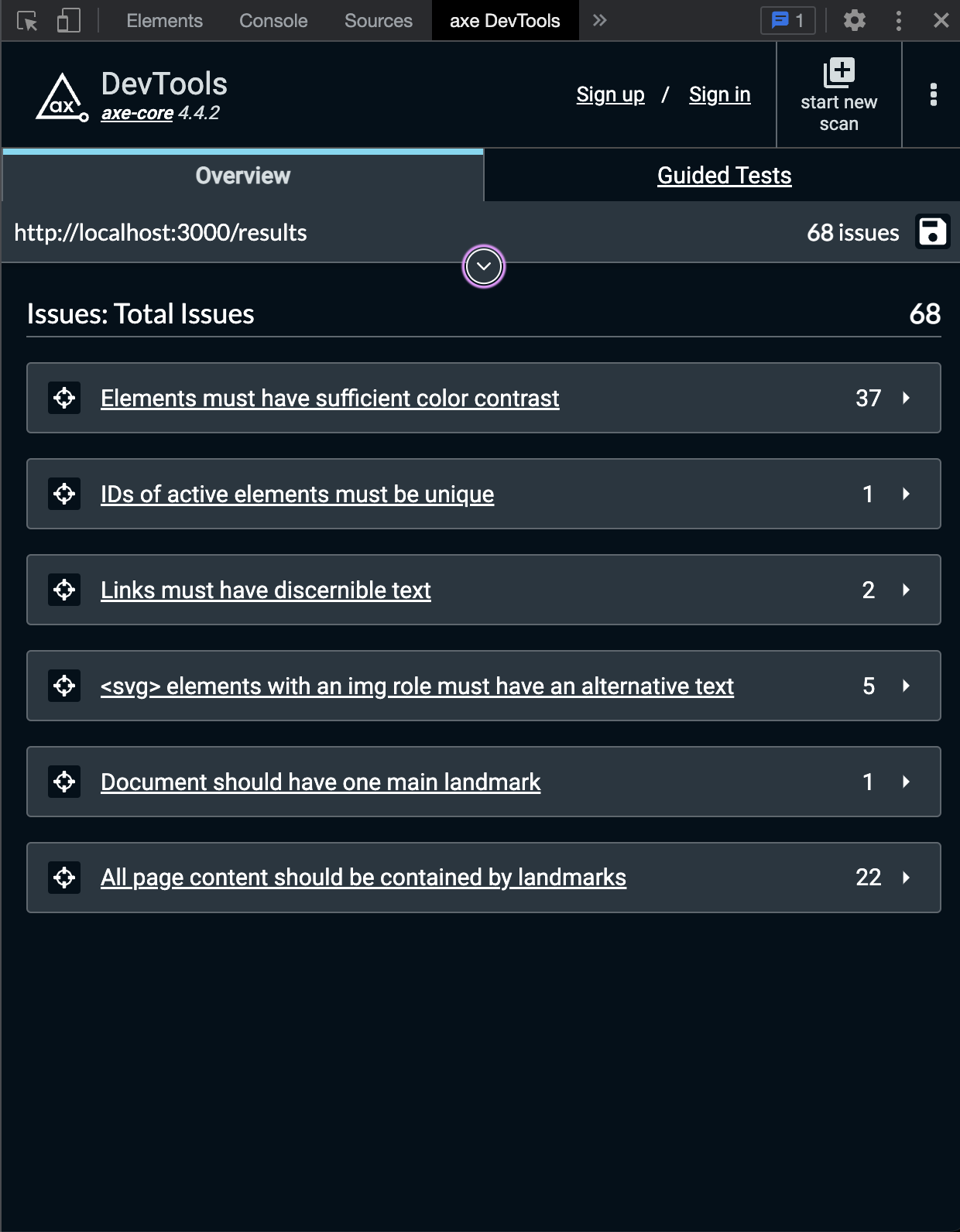
Underneath the summary you can find the issues themselves, bunched together telling you “you did the exact same mistake in 37 separate places”. The titles try to be clear, but of course more details roll out as you click them.
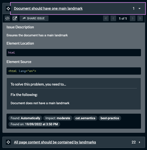
The issue details are really descriptive, trying to point out where exactly it happened and suggesting solutions. If you still don’t know what it is about or where the issue is, the two buttons in the top left corner help. One of them is switching to the “Elements” tab and highlights the element affected, and the other one opens aXe rules documentation.
In our case for some reason we forgot to use the semantic <main> tag, hence the issue. If you look at the next problem found, it’s about the same thing, but from a different perspective, so adding the tag in the correct place will fix 23 things at once. Talk about killing twenty-three birds with one stone. Or less murderously in Polish - “making twenty-three roasts with one fire”.
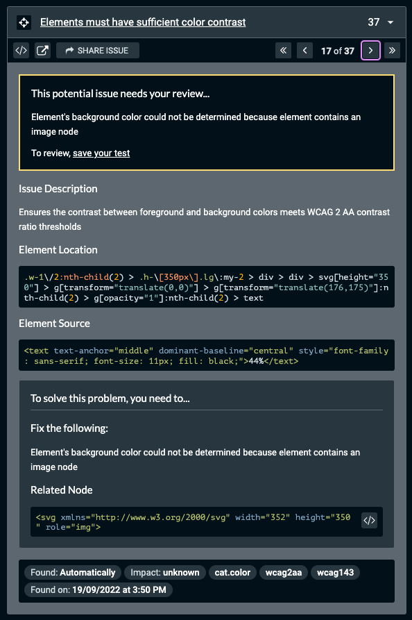
aXe also knows its limitations; it marks some of the issues as “needing review” (“hooman, help me, I can’t be sure”). It happens for example with color contrast in cases where aXe can’t recognize the real color of the background like a multi-colored background picture. In our app, we’re using a library that draws charts with SVGs, so aXe can’t calculate the contrast between the chart piece and its label displayed on top of it.
Half of our issues is the chart-label pairs, and the other half is between our app’s primary color and the off-white of the background. Technically the contrast is too low, but if I asked you for your opinion, you’d probably say it’s absolutely fine.
That’s because of the way the contrast is calculated. As a side note, I’m quite excited about the new approach to contrast. Today’s standard calculates it in a way that doesn’t quite take into account the human eye’s color perception, which means for example that a white text on orange background fails the test even though it’s perfectly fine in our human subjective opinion. Lisa Charlotte Muth from Datawrapper writes more about it in their blog if you’re curious. The new kind of calculations might be included in the WCAG version 3, so in 2-3 years - a bit of a wait still ahead of us.
Practically how, part 2 - manual testing
Two big things (but not the only ones!) to manually test is keyboard interaction and screen reader accessibility.
Keyboard interaction
First of all, it’s not only for the blind; many able-bodied people don’t use the mouse by choice as well. Having said that, I’ll repeat what many accessibility advocates say: do not hide the visual focus outline. It might be ugly, but it is useful when you’re tabbing through a page.
If using pop-overs, make sure to trap the focus in it. Nothing is more annoying than having to tab-tab-tab-… through the whole page underneath to get the focus into the small centered rectangle asking you “Are you sure?”. Also keep in mind that different HTML elements have different ways of activating them, for example checkbox with space, links with enter and buttons with space again. For this very reason do not disguise links or divs to be buttons; when a user encounters a button-looking link and tries to activate it with a space, guess what happens? The page scrolls instead. How to piss off your user 101.
(A quirk on Mac: you have to turn on the keyboard navigation in your settings.)
Screen readers
Learning to use a screen reader is a bit of an adventure, but it surely makes you aware of what your app sounds like. To your surprise there might be a lot of repetition, which forces you to think of what should be labelled and how, or should some things be hidden, like purely decorative content.
It’s also essential to set the application language to the correct one - otherwise you might end up with “rally English” (if your app is in English, but the screen reader uses the system language - Finnish).
Tools:
- Your own keyboard
- Screen readers:
- Voice Over: built-in in macOS and iOS.
- Narrator: built-in in Windows 2000 and later.
- NVDA: free program for Windows made by NV Access, a charity and software development company.
- Screen Reader / ChromeVox: built-in in Chromebooks, also available as Chrome extension.
- Web Developer: Chrome extension. You can disable JS, CSS, cookies, check your forms, get images’ alts visible for a quicker checkup, and a dozen other things.
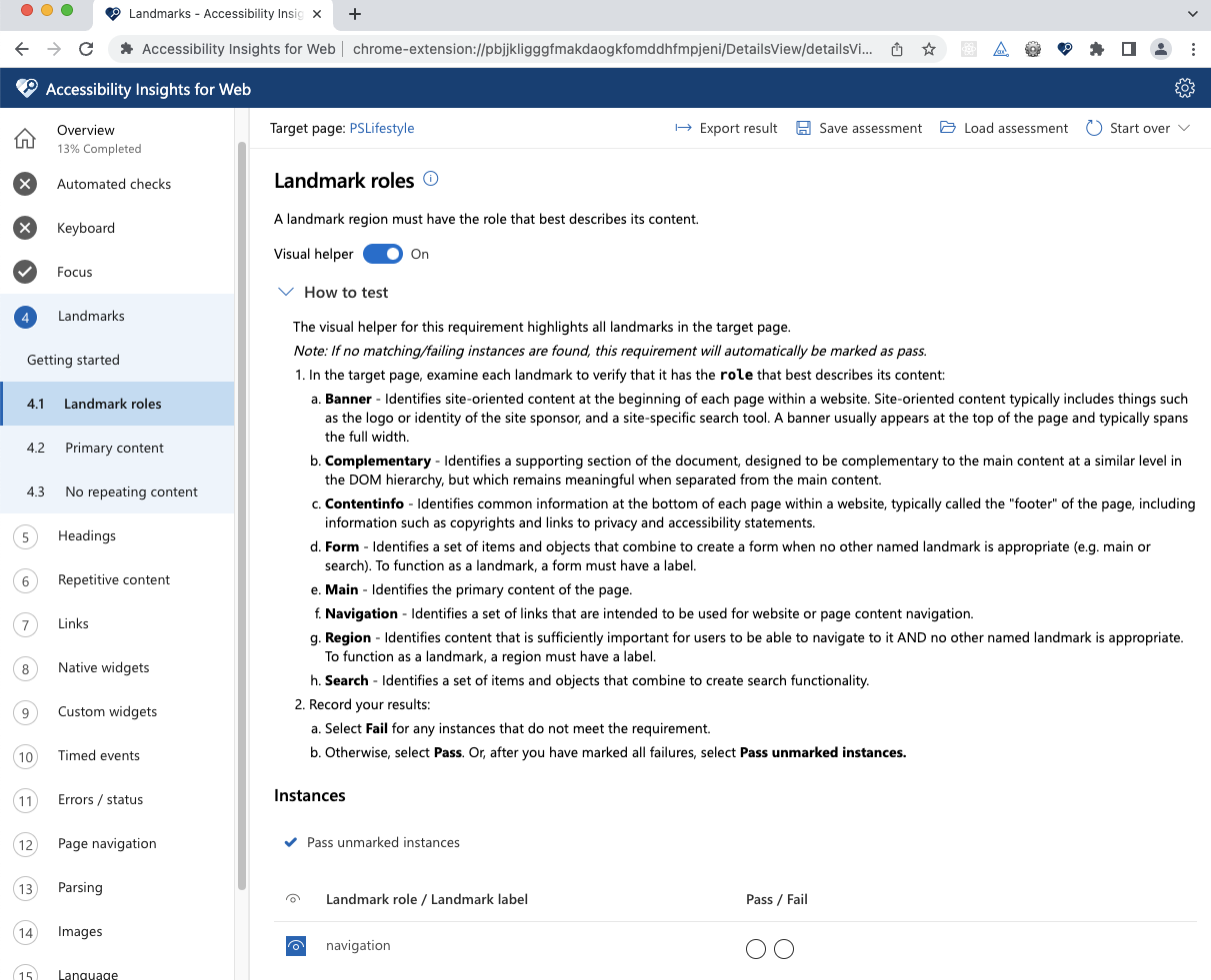
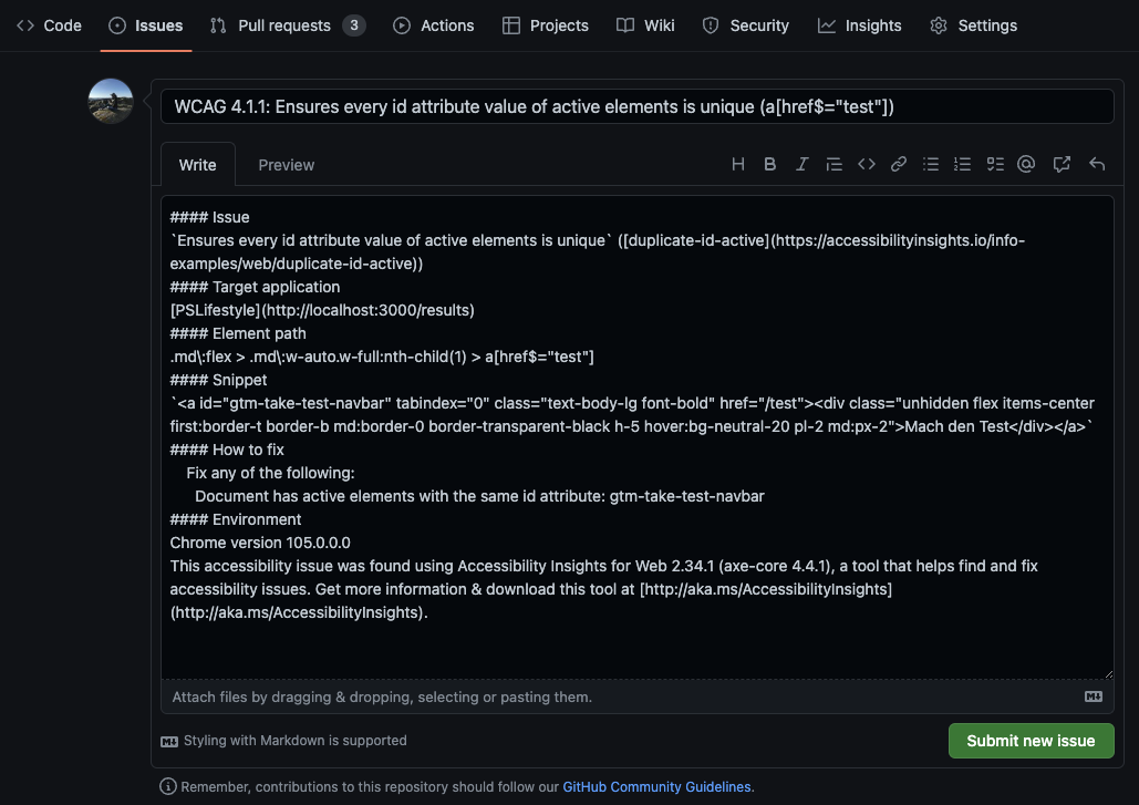
- Accessibility Insights for Web: an extension for Chrome and Edge having automated checks against around 50 accessibility requirements, tabbing testing help and instructions for manual tests. Easy to create reports!
Example of using Accessibility Insights for Web in a project:
If you have to limit yourself to using just one tool, choose Accessibility Insights for Web. It has tons of tests, both manual and automatic (covering partially what aXe does, with yet another way of visualizing). It’s very thorough and gives you an important argument for your discussion with the manager “why should we waste our precious time” - you can create a report! The document can be exported in an HTML version, which makes it even easier to understand for non-techy people.
The whole tool has three main parts:
- Fast Pass: Automated checks (color contrast, duplicate IDs etc.), tab order, “needs review”. Below the screenshot from the tool you can see the visualization of the issues in our app’s navbar.

-
AdHoc Tools: Quickly toggle the highlighting of landmarks or headings, toggle color (black and white). Not really full-fledged tests, but rather for a quick visual scan with your eyes.
-
Assessment: A thorough set of tests that results in a detailed report. Starting with automated checks and going through 23 (!) other topics, you check off what’s passing and where your app fails to cover WCAG 2.1 AA success criteria.
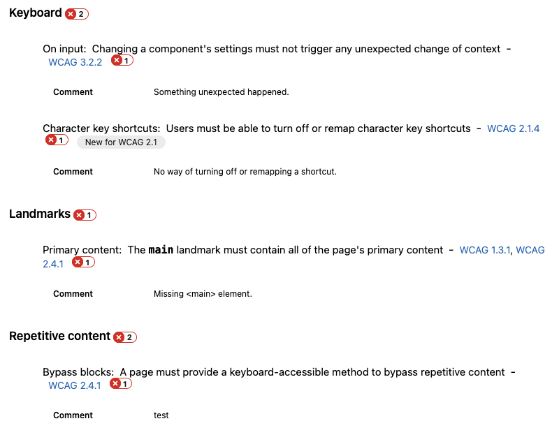
In both Fast Pass (tab stops) and Assessment you make the pass/fail judgement yourself and mark it manually accordingly, but worry not, there is plenty of instructions, videos, links to WCAG, and you can leave notes at specific issues about failure instances.
The instructions and additional informative texts are written in a way understandable for anyone, not just for people who are neck-deep in accessibility. It makes the tool itself accessible and easy to use for every person. Accessibili-ception!
When you’re halfway through the testing, but have to stop or hand over to a teammate, you can save an unfinished assessment as a file, and whoever picks up the work next just loads that file into the tool on their machine. I think it’s a really good way of making the workflow smooth.
When you’re heroically done with all the tests and your overview page looks something like this (hopefully more green)…
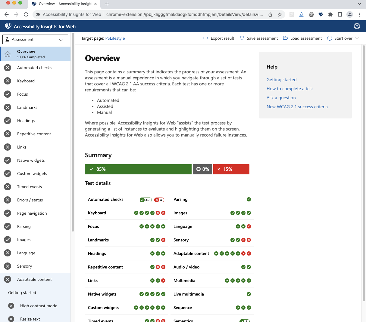
… it’s time for everyone’s favourite corporate thing - a report! Apart from the same summary you saw in the overview, you get all the details you had noted about failed instances and direct links to specific WCAG rules the issue is violating.
In the settings of the tool there’s even issue filling to GitHub and Azure Boards. Well, it’s not quite surprising when you consider that all three services are owned by Microsoft. If you’re using the issues feature in GitHub, it seems like the easiest way to get the accessibility tickets right into your backlog with all the necessary details and links.
Goodie bag to take home
As Eevis and many other accessibility advocates say, it’s difficult to compile a complete accessibility checklist, but below you’ll find my humble attempt at collecting the very basic things to check.
The bare minimum for a good start:
- Run automatic tests - they check headings hierarchy, missing alts, color contrast, missing landmarks, non-unique IDs etc.
- Headings - they should make sense when used as a table of content of the webpage/service.
- Buttons are
<button>, links are<a>- no<div>used for those purposes! - Useful alternative texts - empty (but existing!) on decorative images, meaningful text describing meaningful images
- Keyboard navigation - unplug your mouse, tab through your app (pay extra attention to pop-overs and focus traps), interact especially with links, buttons, inputs incl. checkboxes, radio buttons, dropdowns.
Eevis’s workshop during React Finland made me rediscover my curiosity about accessibility. It also showed me the tools a professional can use, so let’s spread the knowledge of them. The truth is, we can do the basics with really small effort, so why not? Of course I’d encourage you to dig deeper and make your creations more and more usable for all kinds of people. Do your part in making the world a better place - for everyone!