If you’ve been following the front-end development scene lately, you may have heard a mention or two about Tailwind CSS. Tailwind has revolutionized how we style web applications with functional CSS, and developers have taken notice – it brings a lot of control to the developer, thus increasing developer experience. The project has gained significant ground, and the trend seems to continue in its favor. In this blog post, I’ll explain:
- History of Tailwind CSS
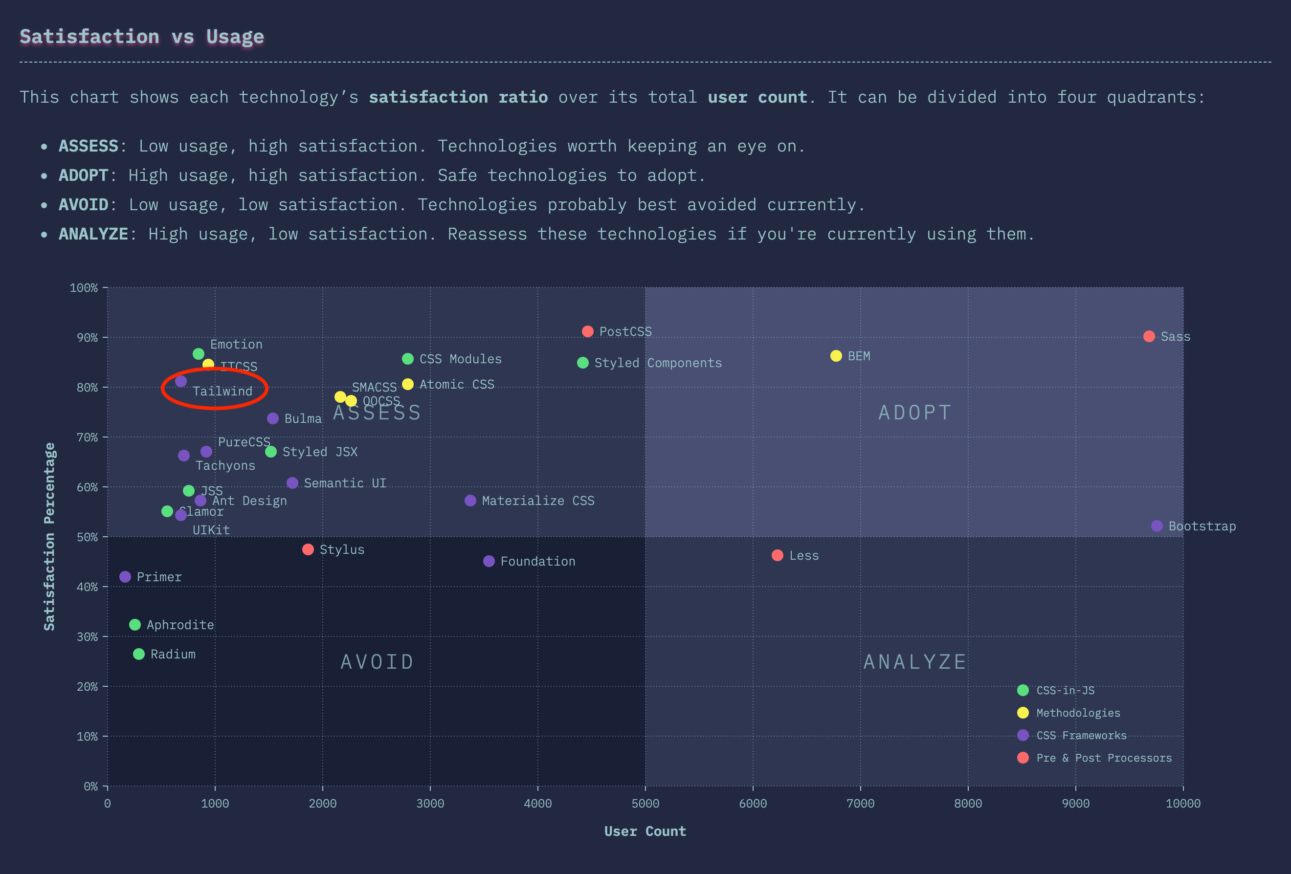
- What is Tailwind CSS
- How to use Tailwind CSS
I like to begin with history so let’s jump into that. You may go ahead with examples if you feel like it.
History
Tailwind was born off work by Adam Wathan and Steve Schoger, who you might know from their other popular projects, such as Refactoring UI. The team behind the project released it on GitHub on the 1st of November 2017.
Tailwind has a curious background story because Wathan was publicly working on KiteTail on his YouTube channel before its initial release. The viewers of those videos encouraged Wathan and Schoger to open source their “Less framework.” Some of Wathan’s friends and followers also found the utility-based aspect of it intriguing, namely Jonathan Reinink and Stefan Bauer, and offered to help. Less didn’t quite bend in the way of what was required, so the project moved on to use PostCSS instead, as David Hemphill suggested. Afterward came v0.1.0 launch time.
Since then, Tailwind has reached v2.0.1, and all but Bauer still work on Tailwind. It now includes plenty of essential features such as:
- Purging of unused rules with PurgeCSS
- Screenreader utilities
- CSS transitions
- CSS grid
- Plugins
- Animations
- Dark mode
Examples
Enough of the past. Let’s get to the good stuff; Demos! We’ll be using something called CodeSandbox, which is a fantastic tool, and I recommend it to you wholeheartedly. Unfortunately, you can not edit the embed below directly. If you wish to do that, push the “Open Sandbox” button and log in to CodeSandbox. The template I’m using uses Parcel for bundling, so it already includes PostCSS. The template features React v17.0.1 and Tailwind CSS v1.9.6 to create the UI. You could also use Angular, Svelte, Vue, or whatever for building components as well. If you want to quickly try out Tailwind CSS and don’t want to hassle with JavaScript components, you could use Tailwind Play.
Example 1 - Basics
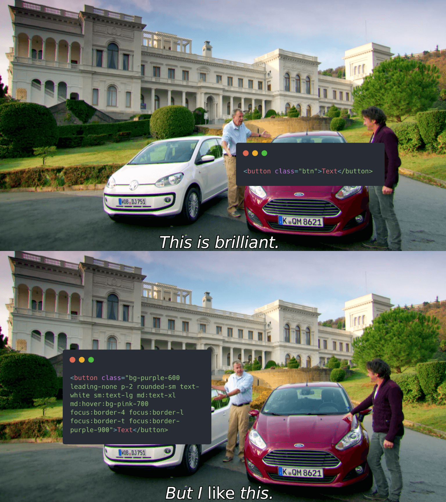
In example 1, we see Tailwind in its most basic form. It provides the button styles to make it look like a button. When the input is class="p-2 leading-none text-white bg-purple-600 rounded-sm" the output is
.p-2 {
  padding: 0.5rem;
}
.bg-purple-600 {
  --bg-opacity: 1;
  background-color: #805ad5;
  background-color: rgba(128, 90, 213, var(--bg-opacity));
}
.leading-none {
  line-height: 1;
}
.rounded-sm {
  border-radius: 0.125rem;
}
.text-white {
  --text-opacity: 1;
  color: #fff;
  color: rgba(255, 255, 255, var(--text-opacity));
}
What I’ve described above is called functional and or utility-based CSS – a set of reusable classes that will only apply a singular rule. Typically you would give the element a single class, such as class="btn", and then you would write in your CSS .btn { ... }. This example I’ve just introduced you is, of course, wildly exaggerated, but I want you to pay attention to the following markup:
<!-- Snippet 1 -->
<button class="p-2 leading-none text-white bg-purple-600 rounded-sm">Continue</button>
<button class="btn">Continue</button>
Notice how it is immediately clearer how the button will look like just by looking at the markup. Tailwind is all about these classes, how they are named, their output, and the connection between them, and since they already exist, you don’t have to spend any effort to come up with fitting names. Using these utility classes is like baking cupcakes; The element or component is the batter, and utility classes are the sprinkles on top. Sprinkles make the cupcake nice and shiny, while solid batter provides base and structure.

The second line in snippet 1 is semantic CSS or traditional CSS, if you will. It’s generally agreed that the markup should not take part in the design, but I believe that kind of thinking doesn’t apply in modern web development. That may have been applicable ten years ago, but today web applications are built upon components. We don’t need methodologies like BEM anymore, and CSS doesn’t have to be semantic when we can use reusable components instead. Trying to solve the separation of concern with CSS on the component era of web development is a waste of time, and that time could be used on something else worthwhile.
Let’s continue and take example 1 just a tiny step further in example 2.
Example 2 - Prefixes
Note that in the CodeSandbox preview, the viewport isn’t wide enough to show all the breakpoint changes. Try the “Open Sandbox” button to explore differences further!
Here example 2 showcases how we can modify an element’s looks with prefixes. Tailwind uses many prefixes for class names, and the most apparent of them are responsive utilities: sm, md, lg, and xl. By default, you can use these prefixes with any other class. You can even use them together with different prefixes like this md:hover:bg-pink-700. You can customize the default breakpoints and even add your own in tailwind.config.js, of course.
Example 3 - Variants
Moving on to example 3; Changes made in this example may not be immediately apparent, so go ahead and try focusing the button by pressing the Tab key. You should see borders around the button. Some classes in Tailwind may require configuration. In this case, it is the border width (focus:border-4 focus:border-l focus:border-t) applied on focus. For the focus prefix to work completely, we have to define a new variant for borderWidth in tailwind.config.js. A variant means a prefixed class in Tailwind’s context. So basically, they are the same.
Take a peek at the
tailwind.config.jsfile by changing the tab in the embed.
Now we can use the focus prefix to show borders on focus. Tailwind has limited default options for pseudo-class variants due to file size concerns. For a complete reference, see the configuring variants page in the official documentation.
Extracting components
When you’re sprinkling cupcakes, sometimes you accidentally pour too much at once, and your cupcake ends up with too many sprinkles. This flooding can happen, and most likely will, with utility classes as well. How can we combat this?
Example 4 - The apply directive
Tailwind ships with a couple of helpful directives; One of them is @apply. You can think of directives as a function. The apply directive is used in CSS to extract rules of provided classes to the target selector. In other words, you can merge multiple classes into a single class.
You have to pay attention, however, when you’re using the apply directive. It’s easy to fall back to your old habit of writing “traditional CSS” if you blindly use it, which doesn’t exactly flow well with Tailwind. It’s best to use it when dealing with repeating elements, such as buttons, labels, inputs, etc.
I have some bad news. The @apply doesn’t support variants. The good news is that it supports variants if you enable an experimental flag in v1.7 and later, and from v2.0 onwards, variants work as expected with @apply.
To work around the issue, we use pseudo-classes hover and focus in example 4. We will have to use the @screen for responsive variants. The screen directive creates media queries based on your Tailwind config. So for example @screen sm { ... } becomes @media (min-width: 640px) { ... }. As per default configuration, that is.
Another directive that’s in play in example 4 is the layer directive. With the @layer, you can tell Tailwind to include rules inside the target layer. A layer is essentially just a block of CSS that Tailwinds spits out after transforming it. Tailwind uses layering to avoid CSS selector specificity issues. With all that done, we can use the new btn class in our markdown and still use the utility classes alongside it.
Example 5 - JavaScript components
But what about the more complex components like alerts, cards, modals, etc.? Well, you’re likely using some JavaScript framework for composing your UI out of components, so what you want to do is utilize the power of it.
Example 5 is a big step forward visually, but not much is happening Tailwind-wise. To achieve this popup style, we only had to add one new configuration option in tailwind.config.js. The rest is just JSX and React. As a matter of fact, in Tailwind v2, we wouldn’t even have needed to make changes to the configuration.
As your component grows and you have to render content based on props using the ternary operator (myProp ? ... : ...) quickly becomes messy with Tailwind. I would recommend something along the lines of classnames to handle your classes. Also, you should always use the full name of the class instead of concatenating them. So consider this:
// Snippet 2
const textSize = `text-${myVar ? 'xl' : 'base'}`; // Don't do this
const textSize = myVar ? 'text-xl' : 'text-base'; // Do this instead
Otherwise, PurgeCSS may remove the classes during purging. This rule applies even when using libraries or other tools to construct your class names.
As we worked through the examples, we practiced something that could be labeled as a utility-first approach. We started by using just a few utility classes on a button element, which then grew, and we responded by extracting a reusable class from those classes. Most importantly, the extracted class was still compatible with other utility classes. Further down development, we abstracted the composition into a JS component. In other words, utility-first means the direction of development flow when working with Tailwind CSS.
Conclusion
Utility-based CSS, in general, is a somewhat controversial topic among the front-end community. To me, it has completely changed how I feel about styling web applications. It feels very intuitive, albeit like with many technologies, it has its hurdles. Despite that, I think Tailwind’s pros outweigh the cons.
Pros
- No CSS to maintain
- Everything is customizable
- No energy spent on naming classes
- It’s easy and precise to modify how your UI component looks like
Cons
- Extracting sensible components can be difficult
- There isn’t a considerable solution available to elements and components with bloated classes
- No ready-made UI components (although Tailwind isn’t a CSS framework, so to speak, and there are projects aim to solve that)
Considering these pros and cons, I think Tailwind is the best fit for a project that features a component-based web framework and where you want to own your design, for example, by implementing a design system. Or dead-simple static websites where repetition isn’t going to happen too much. Suppose you’re like me though you’re going to love it so much and want to use it everywhere.
This blog post doesn’t cover everything Tailwind has to offer, and some fun ones that you can explore on your own are animations and plugins. Lastly, I want to give you a headstart and leave you off with a couple of helpful links:
- Tailwind CSS IntelliSense for VS Code
- Headwind, Tailwind CSS formatter for VS Code
- A curated list of awesome tools, material, and examples