Data mining and data exploration is an essential part of data science work. Sometimes a business case needs looking for relationships and co-occurrences among the data. Association rule analysis (also known as associate rule discovery, market basket analysis, co-occurrence grouping) is an unsupervised data mining technique for determining relations among variables in large databases. These relations are called association rules. Association analysis answers questions like “What items are commonly purchased together?”, “What things are likely to happen together?” or “What kind of relationships the data has?”. It is commonly used in market basket analysis or in recommendation systems but it can be used just for looking for other interesting relations too.
Finding interesting relationships from obvious ones using domain expertise and interest measures
Many of the rules generated with association analysis are obvious and it is not trivial to find the most interesting ones from the rulesets. For market basket analysis the obvious rule might be “if you buy bread you are likely to buy butter”. In this case the rule looks like {bread} -> {butter}.
There are two approaches for determining if a rule is considered important. We can use objective statistical interest measures or subjective arguments and domain knowledge. Interest measures use the statistics derived from the data and evaluate the quality and interestingness of association rules. Measures do not depend on domain understanding. We simply filter the rules by specifying the threshold for measures like “lift”, or “support”. Lift is an interest measure of “surprisingness” and support is an indication of how frequently the itemset appears in the dataset. A rule is considered subjectively interesting if it reveals surprising information about the data. If the surprising information leads to useful knowledge that can lead to profitable actions, even better. For example, rules like {bread} -> {butter} are not revealing information that we do not already know. Finding surprising and useful rules requires significant amounts of information from the domain experts.
Visualization makes it easier to understand relationships and finding insights
Association rules create combinations of items co-occurring together, and one get easily thousands of rules even from quite small data sets. Visualizing the rules helps to get an overview of the ruleset and relationships. Visualizing rulesets as graphs, with items as nodes and connections as arcs between them, help to find interesting (subjective) patterns from the data.
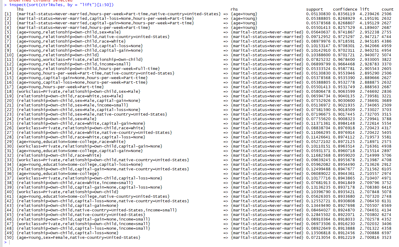
As a visualization example, I used R and ran the apriori algorithm against the Adult data set (Also known as “Census Income” dataset, https://archive.ics.uci.edu/ml/datasets/adult ). The data has income data about people. Running apriori against Adult data set creates 6137 rules and below we can see 50 of them. As one can imagine it is time consuming to shift through rulesets and try to understand relationships among items if they are presented only in a textual format.
.png)
Visualizing very small rules sets using R
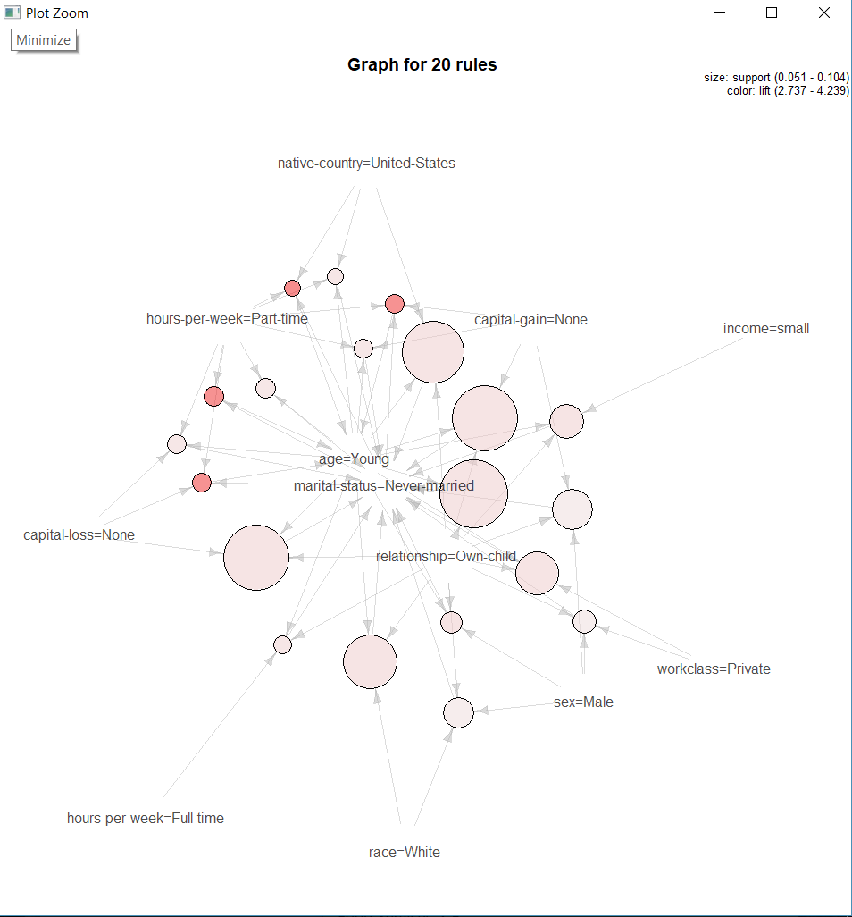
R has a package “ArulesViz” which can create clear graphs on very small rule sets (let us say 10 -20 rules). ArulesViz can draw a graph for a maximum number of 100 rules, but the graph starts to look quite messy already after 50 rules. A small graph like one below looks nice and it is definitely easier to understand the rules from it. However, the picture presents only 20 rules out of 6137. It would be nice to take a broader look over rulesets.
Broader overview with Gephi
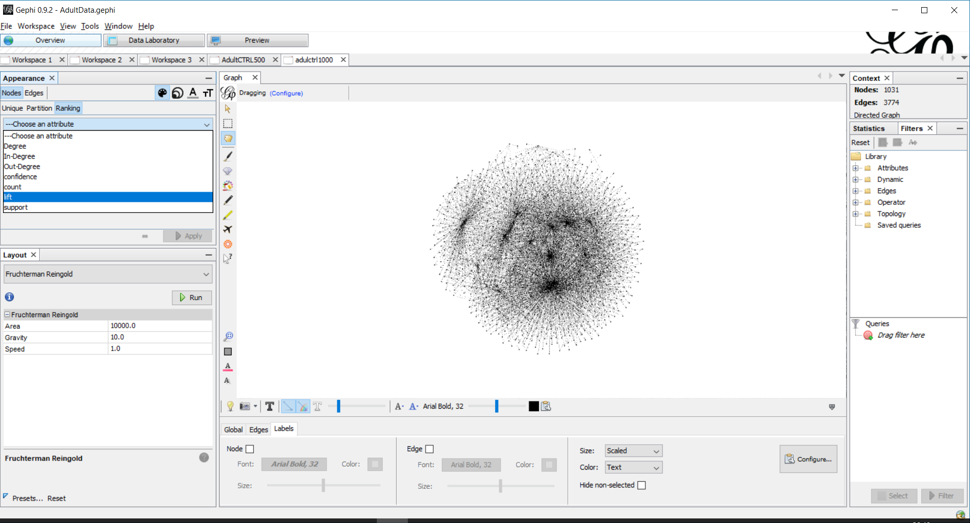
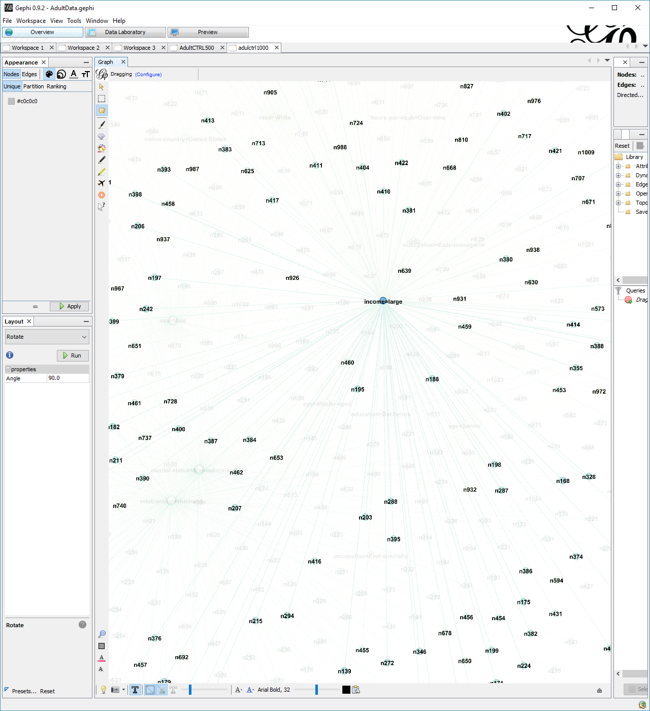
One can use drawing tools like Gephi for broader visualization of the ruleset. Gephi is an open-source network analysis and visualization software where one can zoom into the graph, filter the data sets and color the data with multiple ways. For this example association rules are saved in graphml format. Graphml is XML based format for describing graphs. In R this can be done by writing to the console:
saveAsGraph(sort(rules, by = “lift”)[1:1000], file = “demoGraph1000.graphml”)
The number of rules is limited to 1000 rules because otherwise the graph tends to become too populated and unreadable.
Gephi tool has few algorithm options for drawing force directed graphs:
- Fruchterman Reingold
- Force Atlas
- OpenOrd
- Yifan Hu
Their purpose is to position the nodes of a graph in two-dimensional or three-dimensional space so that all the edges are of equal length and there are as few crossing edges as possible. Fruchterman Reingold is used in the example since it seems to work well for visualizing large rulesets.
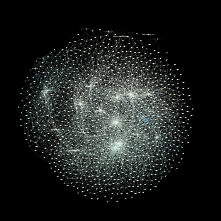
The algorithm can run quite a long time (tens of minutes), but the basic form of the dataset comes visible in a few minute. In the picture below we can see well-connected spots from the data. At this point graphml file is read into Gephi and Fruchterman Reingold algorithm is run against it.
By zooming into the data and adding colors, labels and maybe filters we can start to explore the rule set. We can start by ranking the data with lift and by coloring the ranking. In the picture below yellow color means small lift and denser blue color higher lift. Now we begin to see that there are three major items that radiate to many other nodes. The highest lift (the blue spot on the right side of the picture) belong to the item “large income”. One can also see that “Marital status = never married”, “relationship = own child” , “age= young” is its own separate group in the left side.
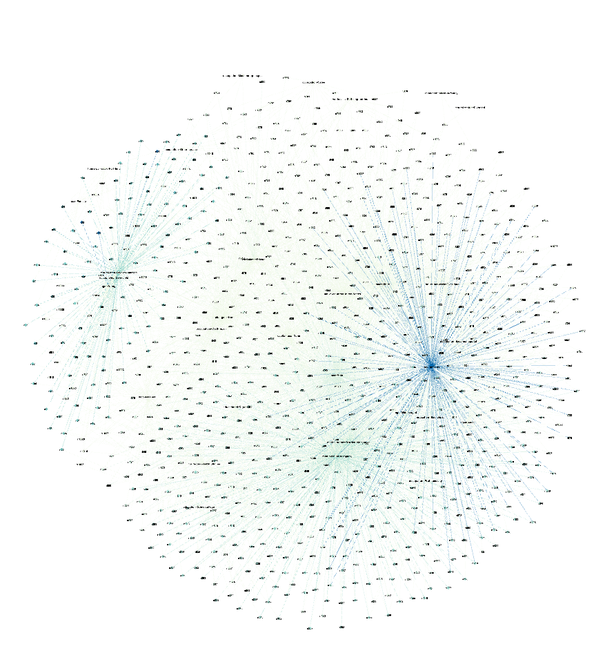
It is possible to zoom in to see which nodes exactly are connected with each other and zoom out for broad overview. This makes scanning through the ruleset and finding something interesting easier. Minor minus of the Gephi graph approach is that it is hard see which items are antecedents (left hand side of the rule) and consequent (right hand side of the rule).
I found this tool super fun and useful to play with. It allows you to change your perspective between overview and more detailed level. This is a very good choice when you need to explore the ruleset and draw pictures of hundreds (or thousands) of rules. Drawing graphs helps to understand what the rule set is made of and how items are related with each other.
Here is one great Gephi video tutorial if you are interested to try yourself.