My first task working for Solita - and actually my first professional programming project ever - was to create a web application to help employees and our partners pick a suitable room for meetings. Microsoft Outlook has almost all required functionality for this purpose but it does not make it easy to find a suitable room fulfilling specific requirements.
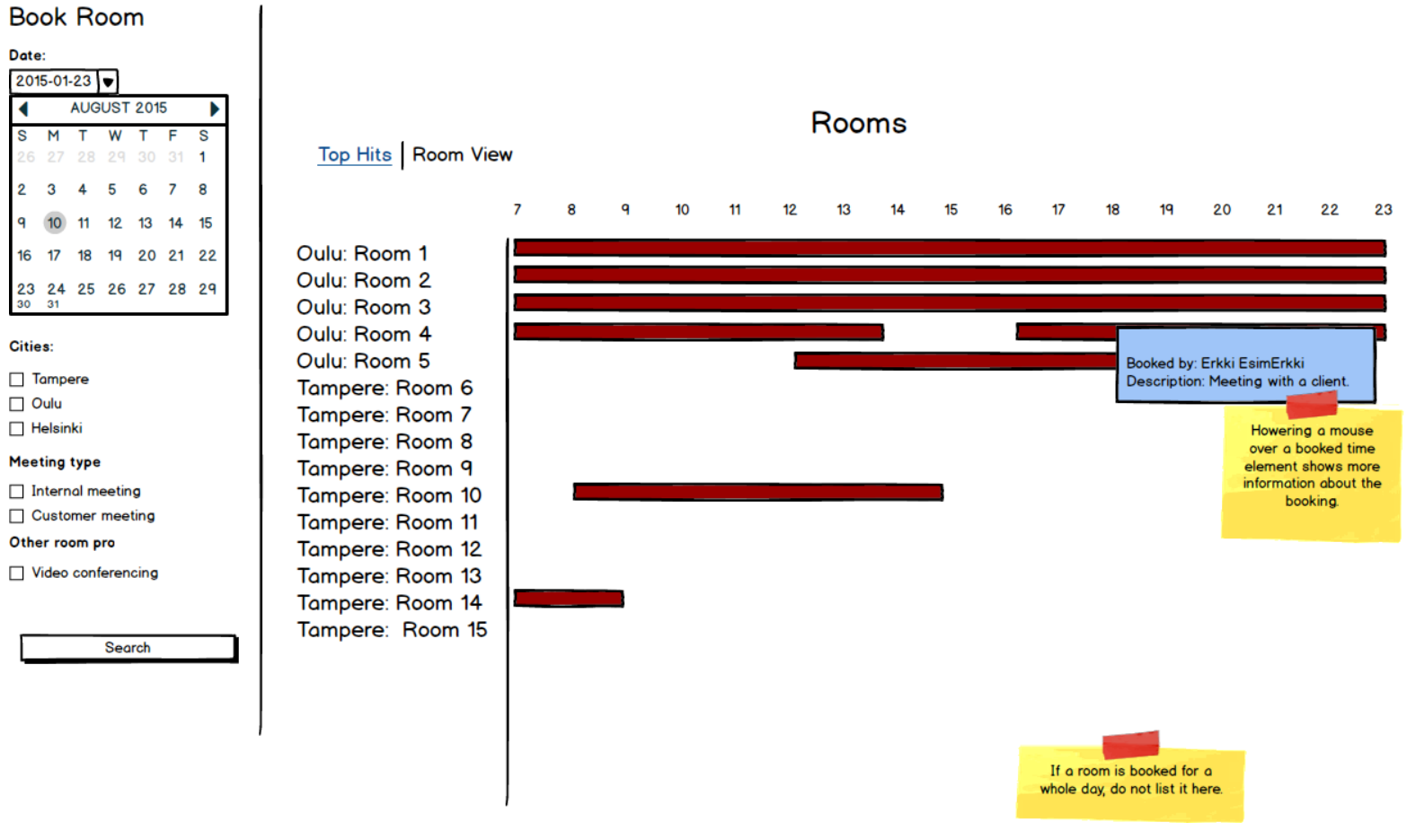
After typical use cases were resolved it was time to design the user interface. The design phase was somewhat easy: the most important parts of the UI were going to be a timeline view, whichs lists rooms and shows their bookings as time bars, and a menu bar, which contains control elements to filter the view for specific needs.
When the core design was done, the application needed just a solid framework and less than 2000 lines of code to be written to be functional. I could have used Angular.js, but I wanted to try something else and thus Backbone.js and its extension Marionette were chosen to create the framework for the application.
 The original layout design
Solving the first problem: Timeline
Perhaps the biggest challenge in the UI was to implement the timeline component. First I tried to search a suitable open source timeline component from the Web since thinking it likely I was not the first to need a timeline component for a web application. I found many potential solutions, most of them were completely free and open source but there were also a few commercial options. All of these solutions contained way too many features that were not needed in my application, so I decided to implement my own timeline component.
There were at least two possible ways to do this in HTML: either with a regular HTML table element with helper divs or simply pure div blocks. This choice was somewhat important because if the base element would need to be changed for some reason the whole timeline component should have been rewritten completely. Since HTML table acted close enough like a timeline and was used in many of the existing timeline libraries, it was chosen as the base element for the timeline component.
Implementing the timeline component was somewhat tricky: calculating the starting position for time bars with JavaScript and positioning them with CSS was relatively easy, but the bar width calculation was challenging. The width of every single column was more or less the same but still different enough to cause problems in the calculation process and in the UI. The best solution I found was calling getBoundingClientRect().width, which promised to return the real element width rendered on the screen. Sadly, different browsers returned different values: Firefox computed a very accurate decimal number and thus was able to render the timeline perfectly while Chrome returned only integer values causing time bars to be a bit too short or long. In the timeline component even small irregularities in time bar positioning was noticeable and annoying.
To demonstrate the inconsistence between browsers, I created this simple JSFiddle page
The solution was to keep using getBoundingClientRect().width to calculate width for each individual column, calculating an average of these and using this value to calculate the width for every time bar based on the length of the meeting. Since the columns were very closely the same width, the solution turned out to be working well. Firefox was able to render the timeline perfectly and Chrome also reached close enough to make the difference unnoticeable.
Another challenge was making the timeline component responsive. All elements had to be positioned using JavaScript every time the viewport width was changed. Luckily JavaScript offered a way to act if window size was changed, but to my understanding it not possible to easily act if an appearance of a scrollbar caused the timeline components width to change. The working solution was to repeatedly check in a certain period of time if the timeline width has changed, for whatever reason, and update the UI by calculating all positions again. This was a bit slow operation but luckily modern browsers were able to handle it well.
Despite the difficulties positioning everything correctly the decision to use HTML table element turned out to be a successful choice since the end result ended up working well on all browsers and window sizes.
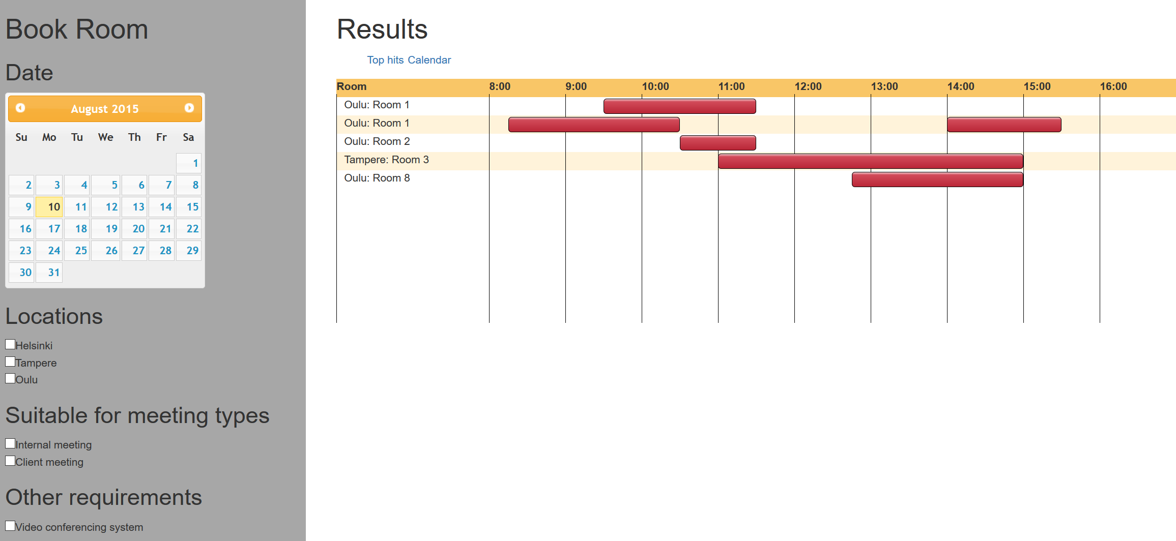
 Screenshot of an early version of Solita Rooms. The visual appearance of the application was terrible but the timeline component was already working with hardcoded test data
Filtering the view
Another important part of the UI was the menu bar which allowed users to choose a date and filter the view based on their prefered settings. Solita has an office in three locations: Helsinki, Tampere and Oulu. Filtering the rooms by location was thus the most important setting in the menu bar but it was also essential to be able to filter the view based on room properties, for example if there is a video conferencing device in the room or if a room is going to be free soon.
Filtering data and showing it to the user is a commonly used method in data-oriented web applications. In Javascript libraries that have good support for reactive programming the view is also updated automatically if the user changes the filtering settings. Unfortunately this was not the case with Marionette since it is an event-based framework. The solution was to make the menu bar listen for changes in the input elements, fire an event which the timeline component then listens to re-render itself. Filtering the view was also challenging with Backbone and Marionette since I needed to filter items based on custom logic. Lucikly there was a library named backbone-filtered-collection that offered this kind of functionality.
Getting bookings from the server
So far I had used hardcoded test data to test the user interface without a server. The UI was working well and it was time to make it useful by getting the real rooms and bookings from Microsoft Exchange Server.
Since I was familiar with Java my original plan was to create a simple Java backend application to retrieve the rooms and booking data from Microsoft Exchange Server and provide an API for the frontend application to access the data in JSON format. It soon became clear that this task could be much more easily accomplished using Microsoft’s C# and .NET platform since Microsoft had built a good support for working with Exchange with C#. Thus, I was able to implement the backend with C# without major issues.
Searching rooms and bookings from Exchange with C# turned out to be very slow, taking usually about 10 seconds. To make the operation faster and also reduce server load, caching was used in the backend. Once the backend gets a request to get booking data for a specific day, it gets it from Exchange and keeps it in the cache the next 60 seconds. The price of this is of course that if the server has just cached the requested data it never sends the most up-to-date data from Microsoft Exchange until one minute has passed. Although a few users have requested a feature to force the server to get the most up-to-date data, I feel that caching helped to reduce the server load significantly and also make it respond faster.
On the frontend side AJAX requests were easy to implement until multiple requests were sent in a short period of time. It was possible that an old request returned from the server causing the UI to show booking data for a date that the user selected previously. This was a situation that was desirable to avoid and luckily there was an easy solution: The data from the server is only shown in the UI if the currently selected date in the calendar matches the date for which the bookings were asked in the request.
Final touches: visual appearance and booking functionality
In my opinion implementing cross-browser web sites and applications is now less painful than before thanks to most browser vendors following standards and implementing new features reasonably fast. Still in implementing the visual design for the application I faced some inconsistencies between different web browsers.
Menu bar checkboxes and slider were implmeneted using standard HTML components and styling them turned out to be a tricky task. Luckily there was a tool called range.css which helped me to create a base style for the slider component and modify it to better suit my needs. The end result looked good, except for Internet Explorer which was unable to render the slider correctly. The only solution I was able to think of would have been to re-create the slider component using pure div elements. However, I knew the user base of the application was mostly using other browsers than IE and the slider was still perfectly usable in IE I thought it safe to assume that the current solution was good enough for now.
In the final stages of the project I was requested to add a booking functionality to the application. Implementing and testing such a feature would have taken time, but fortunately there was a faster way to support this use case. The solution was to allow the user to click a room’s name, which opens a modal dialog suggesting the first possible booking time which the user can modify. When everything is ready, the user can download the booking information as an ICS file. This file can be opened in a calendar application (such as Microsoft Outlook) in which possible participants can be added and the booking saved.
Ruminations
I was lucky to have a relatively solid understanding of the typical use cases of the application which made the development process relatively easy. The technology choice, Backbone and Marionette, mostly provided a solid structure for the application. I also got a lot of support from my colleagues during the development of the project. Based on the feedback, the missing funtionality in Outlook that my application was meant to solve has been at least somewhat useful and time-saving.
Based on my experience, many web developers prefer to use standard HTML5 elements to implement typical UI elements like checkboxes, drop-down menus etc. The great advantage of these elements is that they are recognized by web browsers and thus browsers are able to automatically optimize them for the currently used platform. For example the dropdown menu works differently on tablets and smartphones making it easier to use on a touch-screen based device. However, styling these standard components is sometimes difficult and they also have a limited set of features. Thus, I think one should not be afraid of bypassing these standard components and re-inventing the wheel to solve domain specific problems. The same also applies to using any open source components in the project. It requires some investment, but in the end you have a component that hopefully satisfies your and your project’s needs.
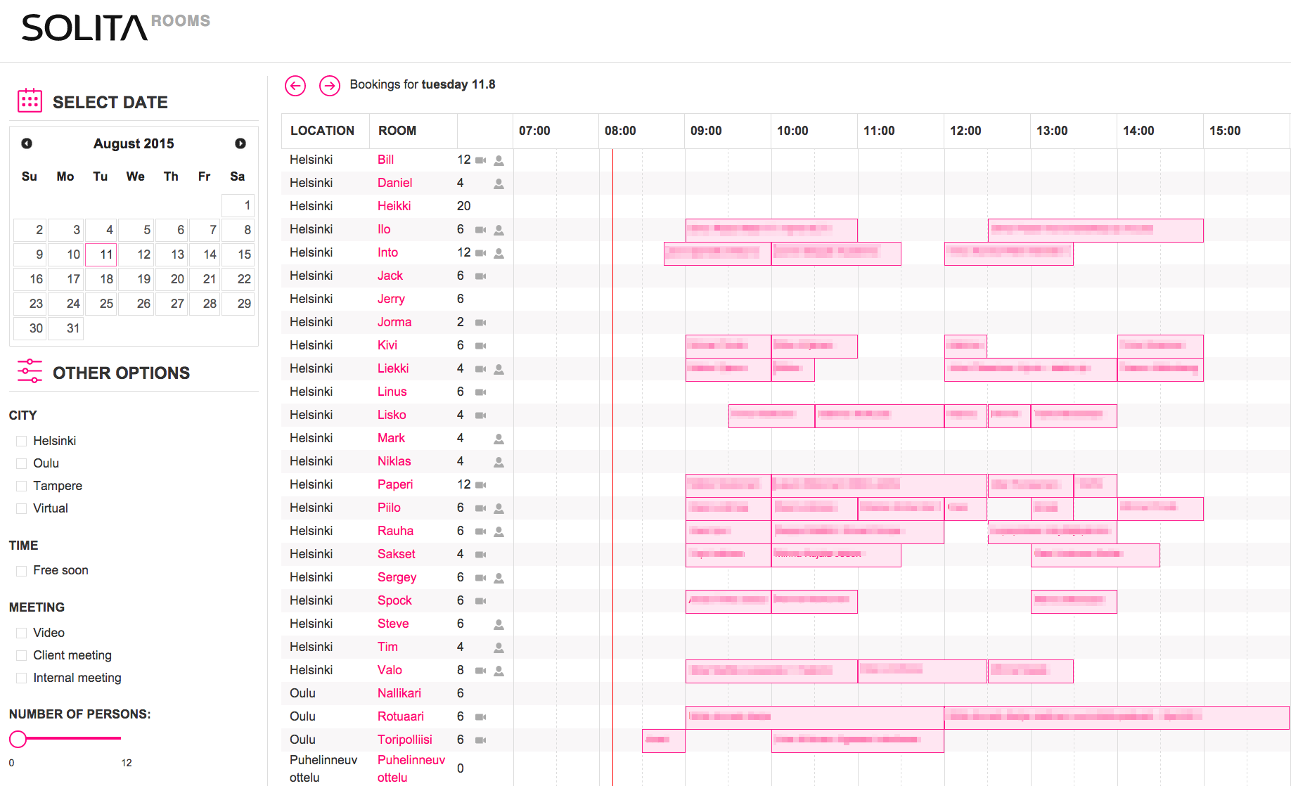
 The final version of the application with meeting subjects censored. Visual design created by Heikki Niemi.