Information visualisation as meaning graphing, plotting and projection of data, is familiar to everybody. Infographic then is a term coined for graphs with combined textual information, possibly embodying some motion and interaction. This post introduces 3+1 aspects that make interactive infographs superior to traditional document based reporting, from the coder’s perspective, unexclusive.

Interactive infographs were first demonstrated by big news agents like N.Y.Times, and they have flourished on subjects as diverse as presidential campaign funding, fashion, and bioscience. Their interactive aspects were powered by client side Javascript visualisation libraries like d3.js.
If you are in a hurry, do skip directly to Three new aspects of infographing.
##Introduction: Draw to grasp
1 2 3
4 5 6
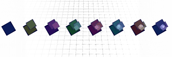
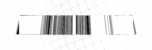
What does this data mean? Graphs and charts assist in such questions. They help in the interpretation, modeling, validation, pruning, mining, enhancing, and communication of data.
The implications of a set of data are painful to grasp from any textual representation. You will get reactions like the following, regardless of data size.
Now when looking at a graph we employ our visual faculties with their sophisticated heuristics to extract information from the world. Visual understanding may operate on a horizontal level, too. A visual impression within the visual memory will help memory to hold.

These are characteristics of all visualisations, shared by interactive infographs and their static predecessors alike. The brain may err by seeing trends where there are none and by doing overinterpretation, but visuals will nevertheless aid and guide other more formal methods. In the area of monitoring, a graphical (well understood) representation shows its absolute strength.
Three new aspects of infographing
Mikhail Bakhtin believed that the use of language is inherently dialogical. Bakhtin suggests that this may be an aspect of life itself, and while looking at systems theory, chaos, and game theory, we get different kinds of mathematical support for this idea.
Anyway, visual interaction added to a graph would enhance it in three ways. Firstly, interaction is likely to increase reading time spent with the graph. Secondly, it assists towards the memorisation of information. And thirdly, interaction could prod towards hypothesis formation and validation by the reader/user, thus solidifying the communicative aspects of graphs. A good online example shows how violence is used within top 50 computer games of 2012, allowing reader to quickly dig into questions of interest.
1. More time with the graph
Interaction will create interest in the average user, and interest will lead to time investment.
The designer should keep in mind that too many features will distract rather than communicate.The possibility to link image features should foster sharing.
There may be a tradeoff however between graph interaction time and time spent reading the rest of the page.
2. Memorisation
View time is a commonly measured web user statistic. Researchers (1, 2) suggest that time of exposure is related to the degree of correctness of memories, as well as to the ability to recall specific memories after different periods of time.

3. Learning through interaction
We find suggestions that the human learning processes operate on much the same principles as the scientific method, that is, by hypothesis-formation, trial and error, reinforcement of successful behavior, and by banishment by counterexample.
Hypothesis-formation operates by query, and to do, we need a view on the target domain. That an interactive graph provides.
Representation is never value neutral. Representational ethics dictates that one should inform their reader of any shortages and discrepancies of the data in question.
##+1. Make it fast
From the engineer’s perspective, latency may not be all, but low latencies and short wait times are actually indispensable.
As graphing goes, the relevant question is how to show a graph and pass minimal data over the connection so that the reader still gets the information they need.

Preprocessing an image on the server side may often be the right thing to do. Nevertheless if the amount of data to pass is smaller in bytes than that of the generated image, selection would favor client side graphing with no exception.
Where online graphing is needed, there are d3js based frameworks available that help make use of accumalated online data (1, 2, 3). D3js itself supports merging.

The shift from static to dynamic graphing has been a change for the better and more solid, both in terms of reinforced information sharing, from the human perspective, and of reduced data transfer, from the technical perspective.
We do these things at Solita.